Community focus.
Human connection.
Coastal wellness.
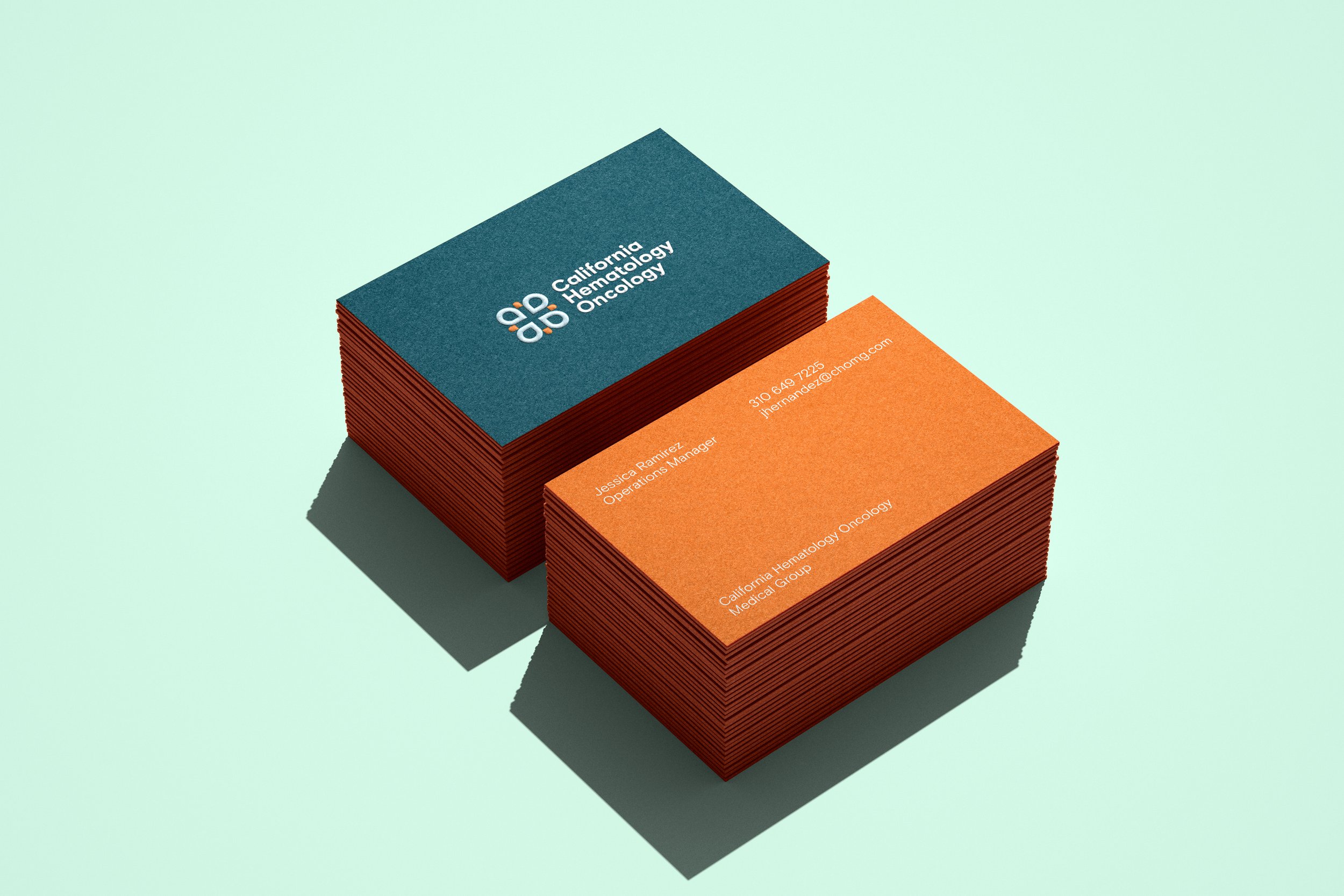
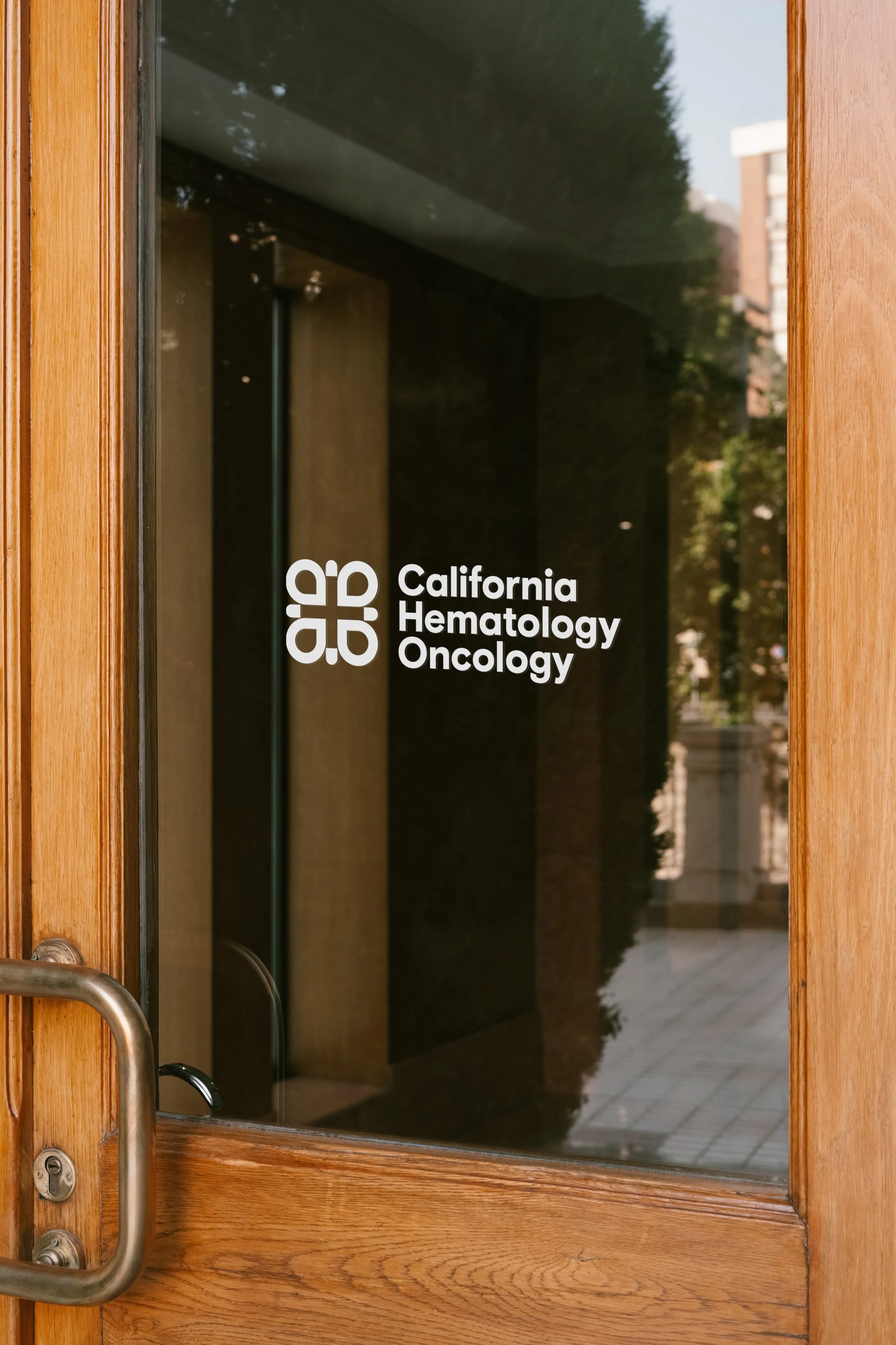
California Hematology Oncology Group came to us with a clear conviction: that healing is inseparable from environment, and that their brand should reflect the Southern California community they serve. The result is an identity rooted in place — ocean blues, warm sandy neutrals, botanical greens, and sunset tones that together evoke the coastal wellness culture at the heart of their practice. The abstract geometric mark distills that spirit into a single, ownable symbol that feels both medically credible and deeply human.
Project scope
The engagement included a full logo system, brand guidelines, stationery and collateral, and digital assets — giving the group a cohesive foundation to show up consistently across every patient and partner touchpoint.